
There's a certain magic to interfaces that feel physical. Not in a skeuomorphic, leather-stitching-and-green-felt kind of way. More like a quiet sophistication. A depth that makes you want to reach out and touch the screen.
Apple's been pushing this aesthetic hard with visionOS and the latest iOS updates. Frosted glass panels. Translucent surfaces that subtly warp whatever sits behind them. Elements that feel suspended in space rather than flatly painted onto a rectangle.
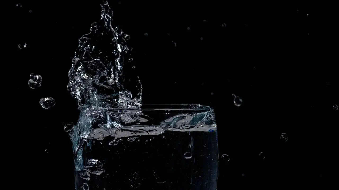
The terminology floating around for this is "liquid glass." It's not an official API or a specific library. It's more of a design language. A set of visual techniques that combine blur, transparency, subtle borders, and light-reactive surfaces to create interfaces that feel fluid and dimensional.
Building this in React Native Expo takes some work, but it's absolutely achievable. Here's how to pull it off.
Before writing any code, it helps to pin down what we're building toward. The liquid glass look typically involves a few key characteristics.
There's a background blur effect, often called a frosted glass or backdrop filter. The surface itself is semi-transparent, letting the content behind it bleed through in a softened way. There's usually a subtle gradient overlay that mimics light hitting glass at an angle. A thin, semi-transparent border creates the edge of the glass panel. And sometimes there's a slight inner shadow or highlight that enhances the dimensionality.
None of these things individually are difficult. Layering them together convincingly is where the craft comes in.
You see this effect all over modern operating systems now. Windows 11 uses it extensively in the Start menu and Settings panels. macOS has had it in the Dock and Finder sidebars for years. iOS uses it in Control Center and notification panels. It's everywhere, and users increasingly expect it in the apps they use.
React Native doesn't ship with a built-in backdrop blur component. At least, not one that works consistently across platforms. So we're pulling in a few key libraries.
The heavy lifting comes from @shopify/react-native-skia, which gives us a hardware-accelerated 2D graphics canvas. Skia is the same rendering engine that powers Chrome and Flutter, so it's fast enough for real-time effects. We'll use it for custom blur shaders and gradient overlays.
For smooth animations, react-native-reanimated handles the heavy math on the UI thread. This keeps animations running at 60 frames per second without stuttering, even when the JavaScript thread is busy. For anything that moves or transitions, Reanimated is the right tool.
We'll also use expo-blur for simpler cases where a basic frosted glass look is enough. It wraps the native blur views on iOS and Android, giving you a decent effect with minimal code.
npx expo install @shopify/react-native-skia react-native-reanimated expo-blur
A quick note on Skia. It requires a bit of setup in your Expo config. Make sure you're using the development client rather than Expo Go, since Skia needs native modules.
// app.json
{
  "expo": {
    "plugins": ["@shopify/react-native-skia", "react-native-reanimated"]
  }
}
The simplest entry point uses expo-blur. It gives you a blurred backdrop that works on both platforms out of the box. It won't win any design awards on its own, but it's a solid foundation.
import { BlurView } from "expo-blur";
import { StyleSheet, View, Text } from "react-native";

export default function GlassCard({ children }) {
  return (
    <View style={styles.container}>
      <BlurView intensity={40} tint="light" style={styles.glass}>
        <Text style={styles.text}>{children}</Text>
      </BlurView>
    </View>
  );
}

const styles = StyleSheet.create({
  container: {
    flex: 1,
    justifyContent: "center",
    alignItems: "center",
    backgroundColor: "#1a1a2e",
  },
  glass: {
    width: 300,
    height: 200,
    borderRadius: 24,
    overflow: "hidden",
    justifyContent: "center",
    alignItems: "center",
    borderWidth: 1,
    borderColor: "rgba(255, 255, 255, 0.2)",
  },
  text: {
    color: "#ffffff",
    fontSize: 18,
    fontWeight: "600",
  },
});
The intensity prop controls how much blur gets applied. Lower values are more subtle. Higher values make the glass more opaque. Somewhere between 30 and 60 usually looks right, depending on the background.
The border color is important here. Pure white borders look harsh against dark backgrounds. Using rgba(255, 255, 255, 0.2) gives you that delicate glass edge that catches the light without drawing too much attention.
expo-blur gets you about 60% of the way there. For the full liquid glass effect, Skia opens up a lot more creative control. You can layer multiple blurs, add gradient overlays that mimic light refraction, and create custom shaders if you're feeling adventurous.
Here's a more advanced glass panel using Skia's canvas:
import {
  Canvas,
  RoundedRect,
  Blur,
  Fill,
  Group,
} from "@shopify/react-native-skia";
import { View, StyleSheet, Text } from "react-native";

export default function LiquidGlassCard({
  width = 300,
  height = 200,
  children,
}) {
  return (
    <View style={[styles.wrapper, { width, height }]}>
      <Canvas style={StyleSheet.absoluteFill}>
        <Group>
          <RoundedRect
            x={0}
            y={0}
            width={width}
            height={height}
            r={24}
            color="rgba(255, 255, 255, 0.08)"
          />
          <Blur blur={20} />
        </Group>
        <RoundedRect
          x={0}
          y={0}
          width={width}
          height={height}
          r={24}
          color="rgba(255, 255, 255, 0.05)"
          strokeWidth={1}
          style="stroke"
        />
      </Canvas>
      <View style={styles.content}>
        <Text style={styles.text}>{children}</Text>
      </View>
    </View>
  );
}
The first RoundedRect with blur creates that soft, translucent base. The second one draws the hairline border. Layering them together starts to look convincingly like physical glass.
You can push this further by adding a gradient overlay that simulates light hitting the surface. A diagonal gradient from slightly brighter in one corner to transparent in the opposite corner creates the illusion of a light source reflecting off the glass.
import { LinearGradient, vec } from "@shopify/react-native-skia";

// Inside the Canvas, after the blurred rect
<LinearGradient
  start={vec(0, 0)}
  end={vec(width, height)}
  colors={["rgba(255, 255, 255, 0.15)", "rgba(255, 255, 255, 0.02)"]}
/>;
That subtle gradient is what takes the effect from "frosted rectangle" to something that feels premium. The eye picks up on the unevenness and reads it as light interacting with a physical surface. It's a small detail that makes a big difference.
Static glass looks nice. Glass that responds to touch and device motion feels alive.
A particularly satisfying interaction is having the glass panel subtly shift its gradient based on where the user touches it. Imagine pressing on the left side of a card and seeing the highlight move toward your finger, as if the glass is catching light from that direction.
import Animated, {
  useSharedValue,
  useAnimatedStyle,
  withSpring,
} from "react-native-reanimated";
import { Gesture, GestureDetector } from "react-native-gesture-handler";

export default function InteractiveGlassCard() {
  const pressedX = useSharedValue(0);
  const pressedY = useSharedValue(0);
  const isPressed = useSharedValue(false);

  const gesture = Gesture.Pan()
    .onBegin((e) => {
      isPressed.value = true;
      pressedX.value = e.x;
      pressedY.value = e.y;
    })
    .onUpdate((e) => {
      pressedX.value = e.x;
      pressedY.value = e.y;
    })
    .onEnd(() => {
      isPressed.value = false;
    });

  const glassStyle = useAnimatedStyle(() => {
    return {
      transform: [
        {
          perspective: 600,
        },
        {
          rotateY: withSpring(
            isPressed.value ? `${(pressedX.value - 150) / 20}deg` : "0deg",
          ),
        },
        {
          rotateX: withSpring(
            isPressed.value ? `${(150 - pressedY.value) / 20}deg` : "0deg",
          ),
        },
      ],
    };
  });

  return (
    <GestureDetector gesture={gesture}>
      <Animated.View style={[styles.card, glassStyle]}>
        {/* Glass content here */}
      </Animated.View>
    </GestureDetector>
  );
}
This gives the card a subtle tilt that follows the user's finger. The perspective transform creates a 3D space, and the rotation values shift based on touch position. Because Reanimated runs on the UI thread, the animation stays buttery smooth even on older devices.
The key is restraint. A tilt of a few degrees feels premium. Twenty degrees of rotation feels like a carnival ride. Small movements, gentle springs, and quick settle times keep the interaction feeling polished.
I built a weather app last year that went heavy on the glass aesthetic. The main dashboard had frosted panels layered over a dynamic gradient background that shifted colors based on the current temperature. The panels responded to touch, tilt, and even the device accelerometer if you moved your phone around.
It looked incredible in demos. Seriously, the kind of thing you screenshot and send to designer friends.
Then I tested it on a mid-range Android device that was about three years old. The frame rate dropped to something resembling a slideshow. The blur calculations alone were eating up GPU resources, and the accelerometer polling made everything worse. Users with flagship phones loved it. Everyone else had a terrible experience.
I ended up shipping a simplified version. Static glass panels with subtle gradient overlays, no real-time blur, no accelerometer. Still looked clean. Still had that premium feel. But it ran at 60 frames per second on basically anything made in the last five years.
The lesson stuck with me. Effects like liquid glass are seasoning, not the main course. They should enhance the experience, not define it. If the effect is getting in the way of the content or the performance, you've probably gone too far.
iOS handles blur effects natively through UIVisualEffectView and the underlying Metal framework. It's fast, energy-efficient, and looks great out of the box. If you've read through our guide on React Native Expo animations, you already know that iOS tends to handle visual effects with less friction than Android.
Android is trickier. The BlurView on Android uses a software-based approach that can be noticeably slower. Skia helps here because it renders through the GPU, but you still need to be mindful of performance.
A practical strategy is adjusting the blur intensity and complexity based on the platform. iOS can handle higher blur radii and real-time updates without breaking a sweat. Android benefits from simpler effects, lower blur values, and caching rendered outputs when possible.
import { Platform } from "react-native";

const blurIntensity = Platform.OS === "ios" ? 50 : 30;
const enableRealtimeBlur = Platform.OS === "ios";
Users on Android won't notice that the glass is slightly less translucent. They will notice if the app stutters. Err on the side of performance.
Translucent interfaces create genuine readability challenges for some users. Low vision users, people with astigmatism, and anyone using their phone in bright sunlight might struggle with text rendered over a blurred background.
Apple's Human Interface Guidelines recommend maintaining a minimum contrast ratio even for glass surfaces. In practice, this means the text on your glass panels should stay legible when the background behind the blur changes. A white background behind the blur can wash out light text. A dark background can swallow dark text.
Consider adding a subtle dark overlay behind the text or increasing the blur intensity to improve readability. Better yet, respect the system's accessibility settings.
import { AccessibilityInfo } from "react-native";

const [reduceTransparency, setReduceTransparency] = useState(false);

useEffect(() => {
  AccessibilityInfo.isReduceTransparencyEnabled().then(setReduceTransparency);
}, []);

// Use solid backgrounds when reduce transparency is enabled
const blurIntensity = reduceTransparency ? 0 : 40;
When users enable Reduce Transparency in their device settings, your app should respect that preference. Swap the glass effect for a solid, opaque background. The aesthetic takes a back seat to usability.
Not every screen in your app needs this treatment. Glass effects work best on overlays, modals, bottom sheets, and cards that float above a visually interesting background. If the background is a flat color, the blur effect is invisible and all that complexity is wasted.
Save liquid glass for moments where it enhances the hierarchy. A music player overlay floating above album art. A weather card sitting over a gradient sky background. A settings panel that slides over content. These contexts let the effect shine.
For everything else, a clean opaque surface with good spacing and typography will serve you better than a blur effect nobody can see.
If you're interested in other ways to make interfaces feel polished without over-engineering, our post on why modern websites feel slower touches on how visual weight affects perceived performance. Sometimes the heaviest-looking interfaces are actually the lightest, and vice versa.
The liquid glass aesthetic isn't going anywhere. Apple's bet on spatial computing and translucent interfaces means these patterns will keep showing up across platforms. Getting comfortable with the tools now puts you ahead of the curve.
Start with expo-blur for simple cases. Reach for Skia when you need more control over gradients, layers, and custom shaders. Use Reanimated to add that subtle responsiveness that makes glass feel physical rather than decorative. And always test on real devices, especially older Android phones, to make sure your effects aren't tanking performance.
The best glass effects are the ones users don't consciously notice. They just feel like the interface has a certain quality to it. A depth and tactility that's hard to describe but immediately recognizable when it's done well.
Building a mobile app and want the UI to feel truly premium? Red Surge Technology helps teams craft polished React Native experiences that perform well on real devices. Reach out and let's discuss your project.