Imagine you’re about to build a treehouse for your kid: you’ve got the lumber, the nails, the plans—you’re pumped. Now imagine trying to hammer each board together blindfolded. That’s a pretty good picture of what it’s like to craft a custom web widget without WAI-ARIA guidance. You know what? ARIA can feel like alphabet soup—confusing, intimidating, and just plain overwhelming. But stick with me. By the time we’re done, you won’t be fumbling around in the dark anymore; you’ll have the confidence to scaffold complex interfaces that feel just as smooth to screen-reader users as they do to sighted ones.
Here’s where we’re headed: first, we’ll settle in with exactly what WAI-ARIA authoring practices are (and just as importantly, what they aren’t). Then I’ll share why these guidelines matter on a human level—beyond ticking off a compliance checklist—and how they even send little love notes to search-engine crawlers. Next, we’ll peer under the hood at the handful of ARIA roles you’ll actually lean on, dive into the dynamic states and properties that bring your UI to life, and I’ll confess some of my own face-palm moments when I tried to “help” a bit too enthusiastically. After that, we’ll talk testing—because flying blind is no fun—and finally, I’ll show you the coolest toolkits, communities, and resources you can bookmark to keep sharpening your skills over the long haul. Ready to turn on the lights? Let’s go.
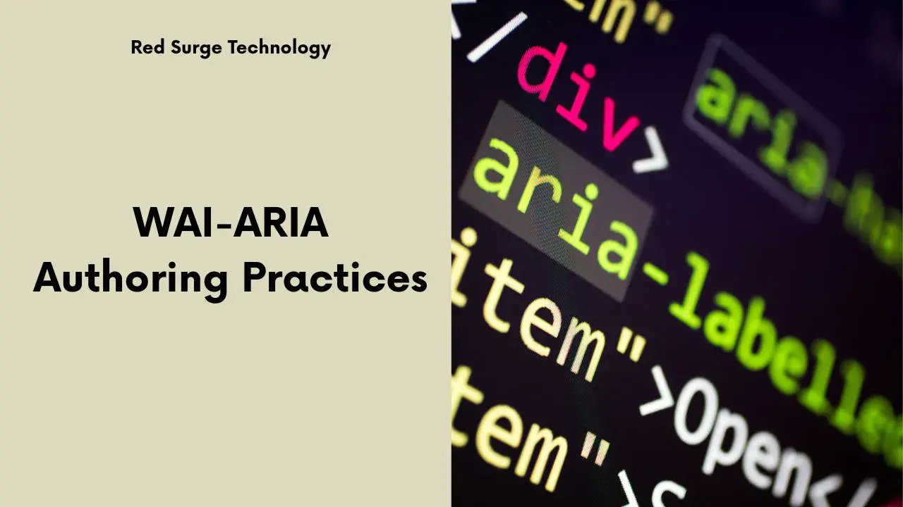
If you’ve ever cracked open the official W3C specifications, you
probably felt a little like you were reading hieroglyphics. That’s
totally normal. The spec lays out the formal definitions—here’s what
role means, here’s how aria-label is
defined, here’s the precise syntax for every little detail. It’s
crucial, no question, but trying to build real interfaces straight
from that can be a grind. Enter the Authoring Practices guide: think
of it as your friendly mechanic’s manual. It doesn’t just list the
parts; it shows you how to grease the gears and make the engine
purr.
Our guiding principle is “HTML first, ARIA when you need it.” Native
HTML elements—like <button>,
<input>, and <nav>—come packed
with built-in keyboard support, focus management, and accessibility
semantics. Browsers know exactly how to handle them, and screen
readers sing along happily. So, if you can use a
<button>, please, for everyone’s sanity, don’t
reinvent the wheel with a <div role="button">.
Why? Because semantic HTML not only makes your life easier when it
comes to debugging but also plays nicely with search-engine
crawlers. Native elements provide a clear roadmap, so Googlebot can
understand your content quickly—no ARIA detective work required.
I’ll never forget my first hackathon stumble. I needed a dropdown
menu for a prototype, and in my infinite wisdom, I slapped
role="menu" on an unordered list, set up some keyboard
listeners, and thought, “Nice! Done.” Then I watched in horror as
VoiceOver droned “menu, menu, menu” over and over for each item. My
heart sank. Turns out, I was treating ARIA like magic pixie dust,
sprinkling it everywhere without thinking. ARIA isn’t a
shortcut—it’s a precision instrument. When used correctly, your
interface hums. When used incorrectly, you’re essentially asking
assistive technologies to read a script that makes no sense.
Accessibility isn’t just a checkbox on some developer’s sprint board. It’s about making the web usable for everyone—people who rely on screen readers, keyboard navigation, or alternative input methods. Let me tell you a quick story. Last summer, I worked on a booking platform. The design team had beautifully laid out all the dates and options, but because the developer team hadn’t applied clear landmarks and roles, my colleague Sara—who’s blind—ended up scrolling through dozens of unlabeled list items to find the check-in date. She spent nearly five minutes just trying to find the calendar widget. It was a stark reminder: when we neglect ARIA, we inadvertently put blindfolds back on our users.
Besides the moral high-ground of doing the right thing, there are real legal considerations. Under WCAG 2.2’s Success Criterion 4.1.2, every interactive element needs a recognizable name, role, and value. And if you’re developing for any U.S. federal project, Section 508 compliance is non-negotiable. But here’s the twist: better accessibility often means better SEO. When you use ARIA to clarify your page’s structure, search engines appreciate the extra context. It’s like giving Google a friendly tour guide instead of leaving it wandering a maze. And who doesn’t like a slightly higher ranking and improved user engagement metrics—like longer time on page and a lower bounce rate?
Let’s trim the fat and talk about the handful of ARIA roles you’ll
find yourself reaching for again and again. First up: landmarks—your
webpage’s “hallways and doorways,” if you will. Roles like
banner, navigation, main, and
complementary help assistive-tech users get a
bird’s-eye view of the page. Imagine adding a simple skip-link that
zips straight to the <main> region; suddenly,
instead of crawling through header links, a user can jump right
where the action is.
Next, think of widgets as your “light switches and thermostats.”
These include button, checkbox,
slider, and tablist. Suppose you’re
crafting a custom toggle switch. You’d assign
role="switch", manage aria-checked to
reflect on/off states, and ensure it’s focusable. A screen reader
will then announce “Switch, on” or “Switch, off” just as naturally
as it does for native controls.
Finally, structural roles like region and
dialog act as rooms or enclosures. If you spin up a
modal dialog, you’ll label it with role="dialog", trap
keyboard focus inside so users can’t tab out into the rest of the
page accidentally, and restore focus to the triggering element once
it closes. These building blocks, when used thoughtfully, let you
construct interfaces that feel native even when you invent entirely
new components.
If roles are the nouns of ARIA, states and properties are the verbs
and adjectives—they tell assistive tech what’s happening and how
each piece feels. Imagine a collapsible FAQ section. You’d use
aria-expanded on each question header, toggling from
"false" to "true" when the answer appears.
That change lets screen readers announce “expanded” or “collapsed,”
so users know what’s going on without extra exposition.
Then there’s aria-hidden, your go-to for hiding
decorative or off-screen elements. Rather than removing items from
the DOM, marking them aria-hidden="true" ensures screen
readers simply skip over them. And let’s not forget
aria-live regions—these are the chat-bubble announcers
of the ARIA world. Set aria-live="polite" for
non-urgent updates, or "assertive" when you need the
news blasted out immediately (but use assertive sparingly; you don’t
want to interrupt other announcements mid-stream).
Here’s the catch: overusing these attributes can backfire
spectacularly. If you drench your page in
aria-hidden="false" or slap
aria-live="polite" on every dynamic area, you’ll drown
users in a tidal wave of announcements. Always ask yourself, “Does
this change matter to someone who can’t see the screen?” If the
answer’s no, save the ARIA for something that truly helps.
Oh, the stories I could tell. Like the time I thought I was doing
everyone a favor by explicitly labeling every
<button> with role="button". I
figured, “Surely that can’t hurt.” Spoiler alert: it hurt. VoiceOver
ended up saying “button button” every time, and users were stuck in
a loop of awkward redundancy. Not my finest hour.
Some of the most common slip-ups include missing labels on icon-only
buttons (no label equals no clue), and accidentally overriding
built-in semantics—like putting role="slider" on an
<input type="range">, which already knows it’s a
slider. Then there are the dreaded keyboard traps: you hide a
dropdown by applying tabindex="-1" to some element,
forget to restore it, and suddenly users can’t tab to the next
focusable control. If that isn’t a face-palm moment, I don’t know
what is.
Whenever you hit a snag, fire up your browser’s Accessibility
panel—it’s like having X-ray vision. You can inspect the computed
name, role, and value of any element in real time. Within minutes,
you’ll spot missing aria-labels, misapplied roles, and
other ARIA misadventures that sneak into your code.
You might have heard the mantra “test early, test often,” but in
accessibility work, it’s more like “test obsessively.” Automated
tools are a fantastic first line of defense. Integrate the
axe CLI
into your continuous-integration pipeline so you catch missing
aria-labels and improper roles before code even merges.
Lighthouse, built right into Chrome’s DevTools, will flag common
ARIA blunders and give you a quick severity rating.
Yet no amount of automation replaces manual testing. Sit down with NVDA on Windows or VoiceOver on macOS and pretend you’re navigating blind. Use the rotor (Control+Option+U on VoiceOver) to jump between landmarks, or hit the T key in NVDA to cycle through buttons. It’s a bit like test-driving a car on a wet track; you’ll feel every slip and slide, every element that sounds off or stalls.
And here’s a pro tip I picked up: pair up with someone who isn’t a developer—maybe a designer or even a non-tech friend. Ask them to find the checkout button, change a filter, or fill out a form without any guidance. You’ll be amazed how much fresh perspective uncovers the stuff you’ve become blind to after staring at the code for weeks.
Accessibility is a journey, not a destination—so you’ll want some
reliable travel companions. First stop: the living
W3C ARIA Authoring Practices Guide. It’s updated regularly and packed with interactive code samples
that you can tweak and test right in your browser. If you’re using
React, check out React ARIA from Adobe: its hooks
like useButton and useSlider abstract away
most of the ARIA boilerplate so you can focus on your component’s
unique bits. Angular developers can lean on the
Angular CDK, which bundles a set of accessible
components—hello, cdkAccordion and
cdkDrag.
For Vue fans, the Vue A11y community maintains directives and plugins that simplify applying ARIA roles and properties. When you need deeper dives, Marcy Sutton’s courses on Frontend Masters are like a masterclass in real-world accessibility. And if you ever feel stuck, drop into the A11Y Collective Slack channel—people there are generous with tips, code snippets, and troubleshooting advice.
Oh, and since it’s summer here in New York, don’t forget to sneak in
a light-hearted seasonal nod—maybe a beachy-themed
aria-live announcement for your “Deal of the Day.” A
little personality never hurt, as long as it doesn’t distract from
usability.
Remember that blindfolded treehouse builder? By now, you’re swapping that blindfold for safety goggles and a trusty level. You’ve learned to lean on semantic HTML whenever possible, sprinkle in ARIA roles and properties only where they truly add value, and test with both automated tools and real people. You even heard about my missteps—because let’s face it, we learn more from the bugs than from the specs.
So here’s your mini action plan: pick your top three widgets—maybe a custom dropdown, a modal dialog, and a slider—audit them with DevTools, add any missing labels or states, run an axe scan, and then click through them using a screen reader. Break something, fix it, and relish the aha moment. Accessibility is a craft, and every tweak you make is one more nail driven straight and true. Ready to build something truly accessible? I can’t wait to see what you create.
If you enjoyed this article, check out our latest post on a WCAG guidelines checklist. As always, if you have any questions or comments, feel free to contact us.
 Call us: (732) 520-3386
 Email us: info@redsurgetechnology.com