A lot of designers, especially when it comes to web design, say not to reinvent the wheel. If you ask me, why not reinvent the wheel? You might come up with something you truly love while doing so. We came up with a list of some of the websites we love that reinvented the wheel. Whether that be with the design concepts or with user interaction. These are the best design websites for inspiration that we could find when we scoured the web.
Besides just looking cool, website design can be a deciding factor for users. Whether they know it or not, a user is more apt to go with a company that has a cool web design rather than some plain jane website. Converting a user as a customer can come down to many things but web design is a major factor in that.
Interaction can become a huge factor in converting users. According to WordStream, “the average landing page conversion rate was 2.35%, yet the top 25% are converting at 5.31% or higher.” The main difference between the average landing pages and the top 25% is the interaction with users. When you get a user to interact with a page, the chances of them becoming a customer sky rockets. If there is one thing you notice about all the best design websites for inspiration we list, it’s that they all have user interaction at some point on their website.
Without further ado, here are some of the best design websites for inspiration we could find.
Superlist

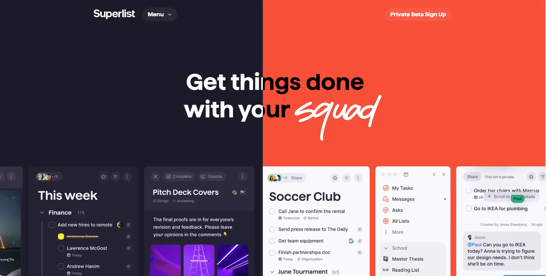
Superlist is by far our favorite website design we found. Not only is the color scheme fantastic, but there is so much interaction throughout the pages. Just the home page banner alone will give you a great feel for the website. You are able to move the blue/red vertical line along the page horizontally. While you move the bar, the content behind it switches based off how far you move the bar. It is an awesome concept and works flawlessly and that is only the home page banner.
You are able to interact with almost every section of the page. This will engage users and keep them interested in what they are reading. As you scroll further down the page, you eventually get to a list. This list is even interactive in a very cool way. When you scroll over an item in the list, it makes it look like the page was drawn on in sharpie. Another very cool concept done flawlessly by Superlist.
FPP

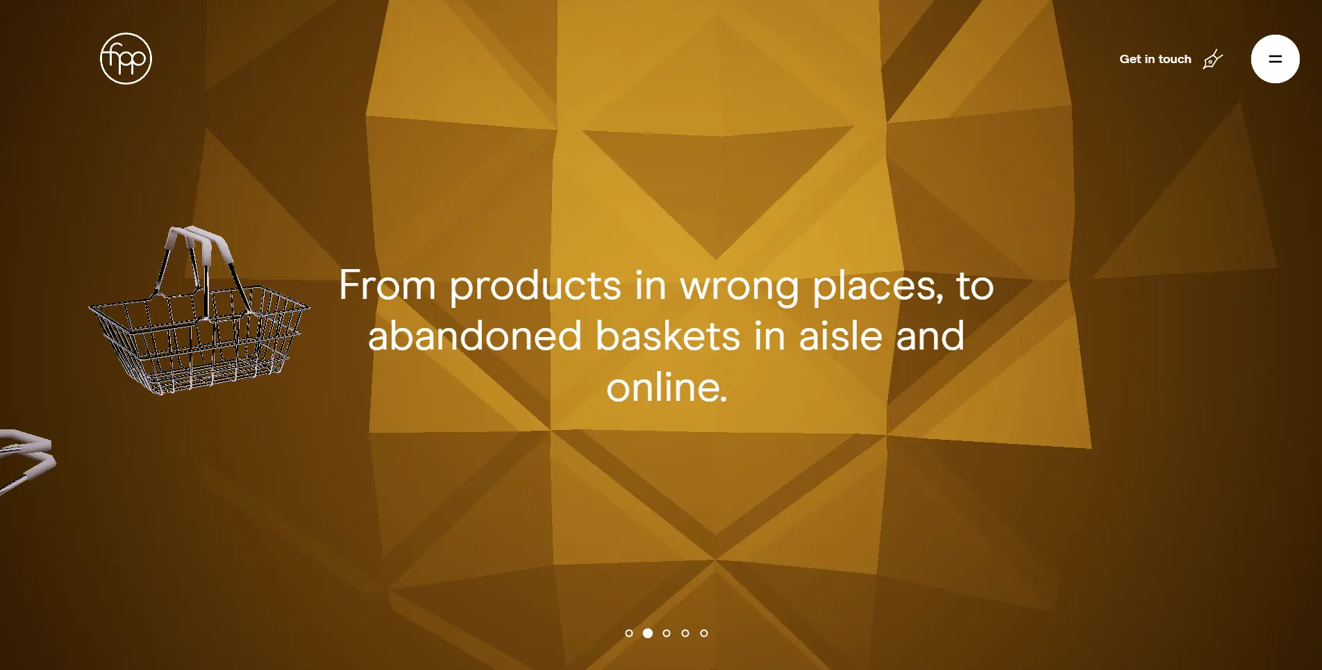
Another awesome site that utilizes user interaction to the max is FPP. FPP is a very interactive site with great design. It is almost like a video game walking you through the introduction when you first open the website. You can go step-by-step through the information with graphics and visuals. Very cool concept and definitely keeps you interested while on the site.
The one downside to this site that I found was the scrolling goes very slow. It takes a long time with a lot of scrolling to get to the next slide. Outside of that, the color combinations and design are perfect and everything looks amazing. If the scrolling just sped up a little bit, FPP would certainly be up there with Superlist.
Hyer

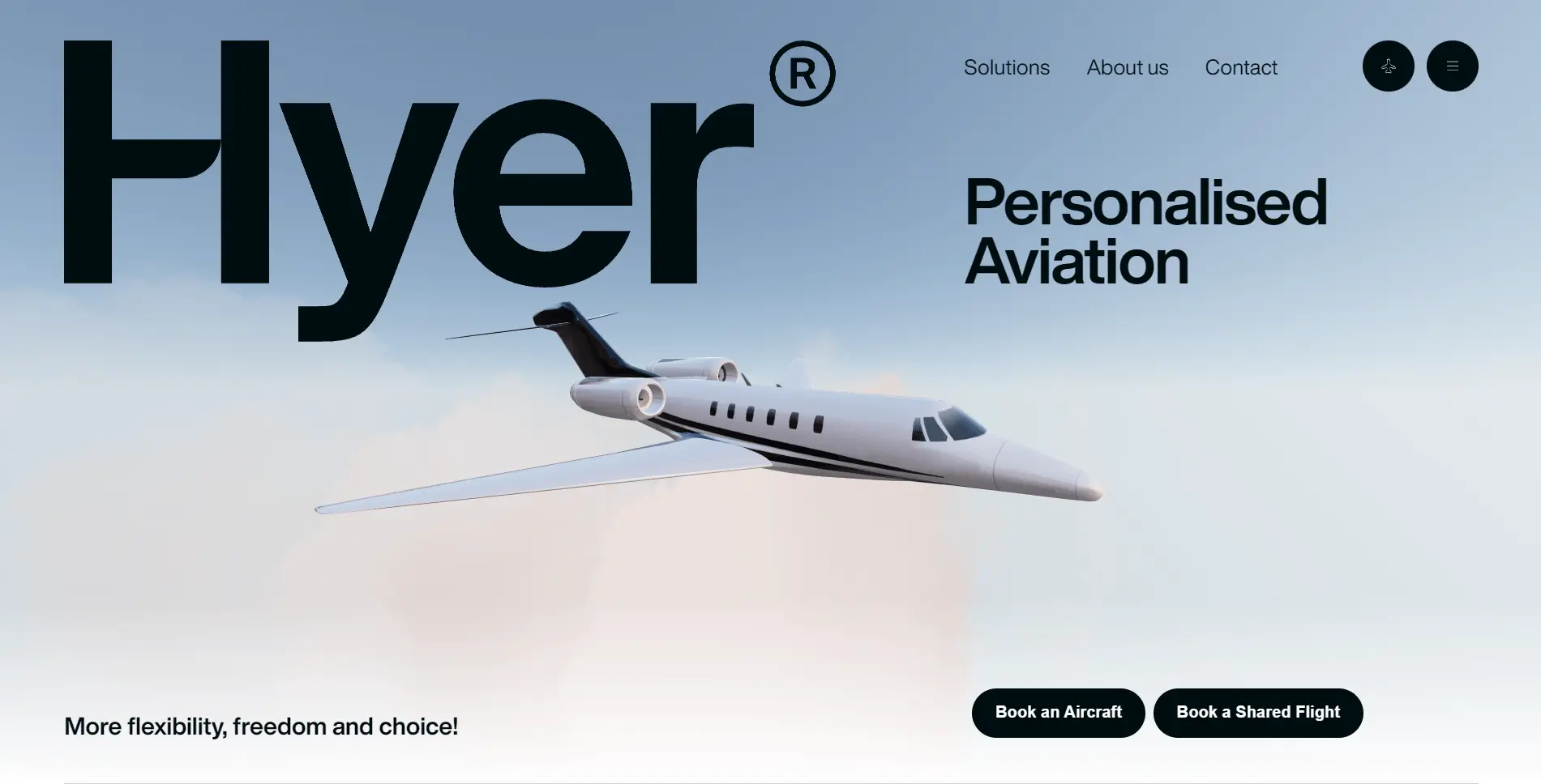
The third website to make our list of best design websites for inspiration is Hyer. Hyer is a personal aviation company. They are a company for people who would like to charter planes and their design fits perfectly for that niche. They have great color schemes and great design. Everything on their site fits together perfectly. There is nothing that makes you think you are on the wrong site or it doesn’t belong. They fly planes and they make sure you know that.
The one reason that Hyer is lower on the list is because there isn’t a ton of interaction. They have an amazing banner on their home screen that is interactive. It is a plane that flies off the screen as you scroll down. Awesome concept and awesome execution by the designer and developer. After that though, you don’t get a ton of interaction. You are mostly just scrolling through, very useful and necessary, information but with no interaction to that information. If they were to find a cool and new way to have the content be more interactive, Hyer would be at the top of the list.
Conclusion
As you can probably tell, we are very big on interaction within design. If you can get a user to drag and drop or scroll through something to have them interact, their conversion rate is so much higher. This goes for every single niche there is. No matter what type of site you have, interaction when it comes to website design is a huge key. Let us know what your favorite type of website interactions are in the comments below. If you enjoyed this read, check out our latest post about lamp vs lemp vs mean stack development. As always, if you have any questions or concerns, feel free to contact us at anytime and we will get back as soon as possible.


