 Call us: (732) 520-3386
 Email us: info@redsurgetechnology.com



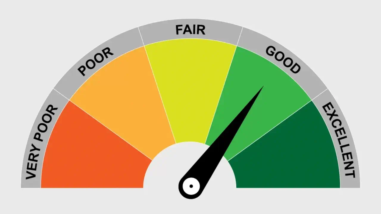
A gauge chart is one of those visualizations that seems simple until you need one. It's a speedometer-style dial that shows a single value on a scale—CPU usage at 72%, revenue attainment at 85%, server temperature at 45°C. Unlike a bar chart or a line chart, a gauge communicates "how close to the limit" in an instant, without requiring the viewer to read an axis.
I've built KPI dashboards where gauges were the primary visualization. Some implementations looked polished and felt responsive. Others were sluggish, hard to customize, and a pain to maintain. The difference almost always came down to picking the right library—or deciding to build the gauge myself with a general charting library.
This guide covers the best React gauge chart libraries in 2026, evaluated specifically for gauge use cases. If you've read our React chart library comparison, you know the general landscape. But gauges are a niche component, and the best options aren't always the ones that dominate generic charting. If you're deciding between a gauge and a bullet chart, our React bullet chart guide covers the alternative in detail.
What Makes a Gauge Chart Different from a Regular Chart
Before we dive in, let's clarify what sets gauges apart from standard charts.
Single value focus. A gauge displays one value on a scale. It's not about trends or comparisons across categories—it's about "where does this number fall?" This makes the visual language different from line or bar charts.
Radial or linear layout. Gauges come in two main forms: circular (speedometer-style) and linear (thermometer or bar-style). The circular version is more common for KPIs, but linear gauges are useful for progress indicators and resource meters.
Color zones. Gauges often have colored zones—green for good, yellow for warning, red for critical. These zones give instant context without requiring the viewer to read numbers.
Animation. Gauges frequently animate the needle or fill when the value changes. This is both a visual polish and a usability feature—the motion draws attention to the change.
Small footprint. A gauge is often one of many KPIs on a dashboard. It needs to be compact and render efficiently when dozens are shown at once.
If you're building a broader dashboard, the strategies from our best React chart library for dashboards guide apply here too. Gauges are just one piece of the puzzle.
The Contenders: React Gauge Libraries in 2026
The gauge library landscape splits into three categories: purpose-built React components, general chart libraries with gauge support, and enterprise suites. Here are the ones worth knowing.
react-gauge-chart: The Classic, Widely Used Option
react-gauge-chart is one of the most popular React gauge libraries. It's MIT-licensed, based on D3.js, and has a simple, declarative API.
What sets it apart:
- Simple API. Pass an
idand apercent(0 to 1) and you have a gauge. - Customizable arcs. You can set the number of levels, colors, arc width, and padding.
- Animation. The needle animates on mount by default, with configurable duration and delay.
- Widely used. Over 99,000 downloads per month, with a large community and many examples.
import GaugeChart from "react-gauge-chart";

function CPUUsage({ percent }) {
  return (
    <GaugeChart
      id="cpu-gauge"
      nrOfLevels={20}
      percent={percent}
      colors={["#10b981", "#f59e0b", "#ef4444"]}
      arcWidth={0.3}
      textColor="#1f2937"
    />
  );
}
What to watch out for: The library has some quirks. The id prop must be unique, and there's a known bug where updating props causes the chart to re-render with a different size—you can work around it by setting a fixed height. The original repository hasn't been actively maintained in a while, though community forks exist. It's SVG-based, so performance with many gauges is limited. For simple KPI cards, it works well.
When to choose it: You need a simple, recognizable gauge with minimal setup and want a proven library. It's a good starting point for dashboards with a few gauges.
react-gauge-component: The Feature-Rich, Modern Option
react-gauge-component is a newer library that offers more customization than react-gauge-chart. It includes a gallery of preset gauges and a sandbox editor so you can design gauges visually.
What sets it apart:
- Rich customization. Inner and outer ticks, custom labels, min/max values, arcs with limits, and Grafana-style gauges.
- Sandbox editor. A visual tool to design your gauge and copy the props.
- TypeScript support. Full type definitions.
- Next.js support. Requires dynamic import with
ssr: falsebecause it's client-side only. - Active development. Regular updates and a responsive maintainer.
import GaugeComponent from "react-gauge-component";

function CPUUsage({ value }) {
  return (
    <GaugeComponent
      value={value}
      minValue={0}
      maxValue={100}
      type="semicircle"
      labels={{ valueLabel: { formatTextValue: (v) => `${v}%` } }}
      arc={{
        colorArray: ["#10b981", "#f59e0b", "#ef4444"],
        subArcs: [{ limit: 60 }, { limit: 80 }, { limit: 100 }],
      }}
    />
  );
}
What to watch out for: The API is more complex than react-gauge-chart, which is both a strength and a learning curve. The bundle size is moderate. It's SVG-based, so very large numbers of gauges on a single page may cause performance issues.
When to choose it: You need more customization than react-gauge-chart offers—custom ticks, labels, or Grafana-style gauges—and want a library that's actively maintained.
react-d3-speedometer: The Speedometer Specialist
react-d3-speedometer is a React library specifically for speedometer-style gauges. It's built on D3.js and supports React 19 (v3.x), React 18 (v2.x), and React 17 (v1.x).
What sets it apart:
- Speedometer-focused. Semi-circular gauge with segments and labels.
- Slim build. A version that doesn't bundle D3, if you already use D3 microbundles.
- Customizable segments. Number of segments, colors, and labels.
- Animation. Smooth needle animation on value changes.
import ReactSpeedometer from "react-d3-speedometer";

function SpeedGauge({ value }) {
  return (
    <ReactSpeedometer
      value={value}
      minValue={0}
      maxValue={200}
      segments={5}
      needleColor="#464A4F"
      startColor="#10b981"
      endColor="#ef4444"
      textColor="#1f2937"
    />
  );
}
What to watch out for: The library is specifically for speedometer-style gauges—if you need a radial progress or linear gauge, it's not the right tool. It's SVG-based, and the bundle size is moderate. But for speedometer use cases, it's polished and reliable.
When to choose it: You need a classic speedometer gauge with segments and a needle, and you want a library that's been around and supports modern React versions.
reactts-gauge-chart: The Chart.js-Powered Option
reactts-gauge-chart is a TypeScript-first gauge library powered by Chart.js. It supports custom limits, colors, and a canvas-based rendering.
What sets it apart:
- Chart.js rendering. Canvas-based, so it can handle more gauges efficiently than SVG-based alternatives.
- Custom thresholds. veryLowLimit, lowLimit, highLimit, veryHighLimit, each with its own color.
- TypeScript. Written in TypeScript, with full type definitions.
- Customizable. Needle colors, font, aspect ratio, padding.
import { GaugeChart } from "reactts-gauge-chart";

function CPUUsage({ value }) {
  return (
    <GaugeChart
      needleCurrentValue={value}
      minValue={0}
      maxValue={100}
      veryLowLimit={10}
      lowLimit={30}
      highLimit={70}
      veryHighLimit={90}
      goodColor="rgba(71, 185, 48, 0.77)"
      highColor="rgba(255, 132, 31, 0.77)"
      veryHighColor="rgba(190, 27, 27, 0.77)"
      needleFillColor="rgb(136, 136, 136)"
    />
  );
}
What to watch out for: The library is relatively new, with a smaller community. The API is more verbose than the simpler options. But the canvas rendering gives it a performance edge for dashboards with many gauges.
When to choose it: You want a canvas-based gauge for better performance with many gauges, or you're already using Chart.js in your project.
@input-kit/gauge: The Lightweight, Dual-Variant Option
@input-kit/gauge is a lightweight library that provides both circular and linear gauge components. It's MIT-licensed, dependency-free, and uses SVG with CSS transitions for animation.
What sets it apart:
- Both circular and linear gauges. One library covers both gauge types.
- Threshold-based colors. Define color scales based on value thresholds.
- Labels and ticks. Optional labels and tick marks for reference.
- Animated transitions. CSS transitions for smooth value changes.
- Tiny footprint. No heavy dependencies.
import { Gauge, LinearGauge } from "@input-kit/gauge";

function ResourceMeters() {
  return (
    <>
      <Gauge value={68} label="CPU" />
      <LinearGauge value={42} label="Memory" width={280} />
    </>
  );
}
What to watch out for: The library is new and less feature-rich than the dedicated gauge libraries. It doesn't support needles—just arcs and fills. But for simple KPI indicators, it's excellent.
When to choose it: You need both circular and linear gauges with minimal bundle size and a clean API.
@darkvoice/gauge-chart: The Layer-Based, Highly Customizable Option
@darkvoice/gauge-chart is a D3-based library that supports solid and segmented layers, pointers, tooltips, and animation. It supports React 16.8 through 19.
What sets it apart:
- Layer-based API. You define multiple layers, each with its own value, radius, thickness, render mode, and color.
- Pointers per layer. Optional pointers for each layer.
- Tooltips and hover. Built-in tooltips and hover dimming.
- Animation and theming. Configurable animation and theme overrides.
import { GaugeChart } from "@darkvoice/gauge-chart";

function MultiLayerGauge() {
  return (
    <GaugeChart
      scale={{ min: 0, max: 80 }}
      layers={[
        {
          id: "tiles",
          value: 75,
          radius: 0.72,
          thickness: 0.28,
          render: "segmented",
          segments: 8,
          color: "#35ff00",
        },
        {
          id: "base",
          value: 40,
          radius: 0.7,
          thickness: 0.12,
          render: "solid",
          color: "#000000",
        },
      ]}
      ticks={{ enabled: true, step: 10 }}
      animation={{ enabled: true, durationMs: 400 }}
      size="xl"
    />
  );
}
What to watch out for: The API is more complex than the simpler options, reflecting its flexibility. It's newer, so the community is smaller. But for layered gauges with multiple values, it's powerful.
When to choose it: You need to show multiple values on the same gauge, or you want a highly customizable, layer-based approach.
livegauge: The Real-Time Canvas Option
livegauge is a real-time animated gauge chart built on canvas. It's designed for 60fps performance with zero CSS imports.
What sets it apart:
- Canvas rendering. 60fps, even with many gauges.
- Real-time updates. Designed for streaming data.
- Momentum and degen mode. Optional particle effects and shake for "degen" trading dashboards.
- Color zones. Define zones on the arc.
- Lightweight. No CSS imports, minimal dependencies.
import { Gauge } from "livegauge";

function SpeedGauge({ value }) {
  return (
    <div style={{ width: 300, height: 200 }}>
      <Gauge
        value={value}
        min={0}
        max={200}
        color="#3b82f6"
        zones={[
          { from: 0, to: 80, color: "#22c55e" },
          { from: 80, to: 140, color: "#f59e0b" },
          { from: 140, to: 200, color: "#ef4444" },
        ]}
        label="km/h"
        formatValue={(v) => v.toFixed(0)}
      />
    </div>
  );
}
What to watch out for: The library is new (v0.0.2) and very niche. It's designed for real-time, high-performance use cases. If you need a traditional static gauge, the other options are more appropriate. But for live dashboards with rapidly changing values, the canvas rendering is a huge advantage.
When to choose it: You need a real-time gauge with 60fps performance and want a canvas-based solution.
Building a Gauge with Recharts: The DIY Approach
If you're already using Recharts for other charts, you might prefer to build a gauge with it rather than adding another dependency. Recharts doesn't have a built-in gauge component, but you can create one using a PieChart with startAngle and endAngle.
import { PieChart, Pie, Cell, ResponsiveContainer } from "recharts";

function BudgetGauge({ current, max }) {
  const percentage = (current / max) * 100;
  const color =
    percentage < 75 ? "#10b981" : percentage < 90 ? "#f59e0b" : "#ef4444";

  const data = [
    { name: "Used", value: current },
    { name: "Remaining", value: Math.max(max - current, 0) },
  ];

  return (
    <div className="budget-gauge">
      <ResponsiveContainer width="100%" height={200}>
        <PieChart>
          <Pie
            data={data}
            dataKey="value"
            innerRadius={60}
            outerRadius={80}
            startAngle={180}
            endAngle={0}
          >
            <Cell fill={color} />
            <Cell fill="#e5e7eb" />
          </Pie>
        </PieChart>
      </ResponsiveContainer>
      <div className="gauge-label">
        <span style={{ color }}>${current.toFixed(2)}</span> / ${max.toFixed(2)}
        <div className="percentage">{percentage.toFixed(1)}%</div>
      </div>
    </div>
  );
}
This gives you a radial gauge (semi-circle) with a colored fill and a remaining track. You can add a needle with an SVG overlay, or just use the arc fill. The advantage is that you don't add another dependency, and you have full control over the styling. The downside is more code and less polish out of the box.
When to choose it: You're already using Recharts and want to avoid adding another library. It's a pragmatic choice for teams that value a smaller dependency footprint.
Enterprise Suites: Syncfusion and KendoReact
Syncfusion and KendoReact both offer gauge components as part of their larger UI suites. They're commercial but include generous community licenses.
Syncfusion React Circular Gauge and Linear Gauge are part of the Syncfusion ecosystem. They offer extensive customization: multiple axes, multiple pointers, annotations, gradients, and tooltips. The Linear Gauge can be shaped like a thermometer or ruler.
KendoReact Gauges include CircularGauge, LinearGauge, and ArcGauge. They support scale ranges, multiple pointers, orientation, and globalization. They're part of the KendoReact premium library.
When to choose them: You're already using Syncfusion or KendoReact components in your application. The integration savings outweigh the licensing cost for most teams. If you're not already in those ecosystems, the standalone libraries above are a better fit.
Comparison Table: React Gauge Libraries
| Library | Rendering | Bundle Size | Types | Pointer | Best For |
|---|---|---|---|---|---|
| react-gauge-chart | SVG | ~15 KB | Radial | Needle | Simple, proven gauges |
| react-gauge-component | SVG | ~25 KB | Radial | Needle/Arc | Customizable, modern gauges |
| react-d3-speedometer | SVG | ~30 KB | Speedometer | Needle | Classic speedometer gauges |
| reactts-gauge-chart | Canvas | ~40 KB | Radial | Needle | Canvas performance, Chart.js users |
| @input-kit/gauge | SVG | ~5 KB | Radial + Linear | Fill | Lightweight, dual-variant |
| @darkvoice/gauge-chart | SVG | ~20 KB | Radial | Pointer/Layer | Multi-layer gauges |
| livegauge | Canvas | ~10 KB | Radial | Needle/Dot | Real-time, 60fps |
| Recharts (DIY) | SVG | Existing | Radial | None/Overlay | Recharts users, no new deps |
| Syncfusion / KendoReact | SVG | ~150 KB+ | Radial + Linear | Needle | Enterprise suites |
Decision Framework: Which React Gauge Library Should You Choose?
Here's the decision tree I use when recommending gauge libraries:
Do you need a simple, proven gauge with minimal setup? → react-gauge-chart. It's the classic, widely used, and easy to integrate.
Do you need more customization—custom ticks, labels, or Grafana-style gauges? → react-gauge-component. The sandbox editor makes it easy to design gauges visually.
Do you need a classic speedometer gauge with segments? → react-d3-speedometer. It's purpose-built for that use case.
Do you need canvas performance for many gauges or Chart.js integration? → reactts-gauge-chart or livegauge (for real-time).
Do you need both circular and linear gauges with minimal bundle size? → @input-kit/gauge. It's lightweight and covers both.
Do you need to show multiple values on the same gauge? → @darkvoice/gauge-chart. The layer-based API is designed for that.
Are you already using Recharts? → Build a DIY gauge. Avoid adding a new dependency.
Are you already using Syncfusion or KendoReact? → Stick with your suite. The integration savings outweigh the licensing cost.
For most React teams starting fresh, I recommend react-gauge-component for its balance of customization and active maintenance. If you need a simple gauge and want the most widely used option, react-gauge-chart is the safe choice.
Performance Considerations for Gauges
Gauge performance is dominated by the same factors as other charts: rendering model and volume. Here are the key considerations for dashboards with many gauges:
SVG vs canvas. SVG gauges create a DOM node per element (arcs, needle, labels). A dashboard with 50 gauges might have 500+ SVG nodes. Canvas gauges (like reactts-gauge-chart and livegauge) render to a single element per gauge, reducing DOM overhead. If you're rendering dozens of gauges, canvas is the better choice.
Memoize gauge components. If your dashboard re-renders frequently (e.g., from live data updates), wrap each gauge in React.memo and ensure props are stable. This prevents unnecessary re-renders of dozens of tiny components. Our guide on preventing unnecessary re-renders in React covers the patterns.
Debounce data updates. If your gauges are updating in real time, throttle or debounce the data stream to avoid re-rendering every gauge on every tick. Our JavaScript debounce vs throttle guide has the details.
Limit animation. Gauge animations are polished but expensive. If you have many gauges, consider disabling animation on all but the most important ones. The performance savings can be significant.
Test on real devices. A dashboard with 20 SVG gauges might look fine on a fast laptop but stutter on a mid-range tablet. Always test on representative hardware.
A Real Story: Gauges in a Server Monitoring Dashboard
A few years ago, I worked on a server monitoring dashboard that displayed metrics for 50 servers. Each server had a KPI card with CPU, memory, disk, and network gauges—four gauges per server, 200 gauges total. The initial implementation used react-gauge-chart.
It worked on small deployments, but with 200 gauges, the dashboard became sluggish. The SVG DOM nodes added up, and live updates caused visible lag. We profiled the page and found that the browser was spending more time on layout and paint than on rendering the actual data.
We migrated to a canvas-based approach using reactts-gauge-chart. The performance improvement was immediate. The DOM node count dropped from thousands to 200 (one canvas per gauge). Scrolling became smooth, and live updates no longer caused stutter. We kept react-gauge-chart for a few "hero" gauges where the extra polish mattered, but the bulk of the dashboard moved to canvas.
The lesson: for dashboards with many gauges, rendering model matters more than anything else. SVG is fine for a handful of gauges; canvas is necessary for dozens or hundreds.
Community Resources and Further Learning
The gauge chart community is smaller than the general charting community, but there are still valuable resources:
- GitHub – react-gauge-chart (https://github.com/Martin36/react-gauge-chart) — The original library, with examples and issue discussions.
- GitHub – react-gauge-component (https://github.com/antoniolago/react-gauge-component) — The modern alternative, with a sandbox editor.
- r/reactjs on Reddit (https://www.reddit.com/r/reactjs/) — Discussions about gauges and KPI visualization appear occasionally.
- dev.to (https://dev.to/t/react) — Tutorials and case studies on React gauge charts.
- Stack Overflow (https://stackoverflow.com/questions/tagged/react-gauge-chart) — The
react-gauge-chartandreact-d3-speedometertags are monitored. - Recharts documentation (https://recharts.org/) — For building DIY gauges with PieChart.
Wrapping Up
The React gauge chart ecosystem has matured significantly. react-gauge-chart provides a simple, proven foundation. react-gauge-component offers more customization and active maintenance. react-d3-speedometer specializes in speedometer gauges. reactts-gauge-chart and livegauge bring canvas performance for high-volume dashboards. And enterprise suites like Syncfusion and KendoReact serve teams already in those ecosystems.
The right choice depends on your volume, rendering preference, and customization needs. For most teams, I recommend starting with react-gauge-component for its balance of features and maintenance, or react-gauge-chart for simplicity. If you're rendering dozens of gauges, look at canvas-based solutions.
If you're building a broader dashboard, don't miss our guides on the best React chart library for dashboards and React bullet chart for an alternative KPI visualization. The right visualization stack is more than just a gauge—it's a cohesive set of tools that work well together.
Now go build something that makes KPIs instantly readable.
Need help building a dashboard with gauges or KPI visualizations? Red Surge Technology specializes in data-rich, high-performance interfaces for monitoring, fintech, and analytics platforms. Get in touch to discuss your project.