 Call us: (732) 520-3386
 Email us: info@redsurgetechnology.com




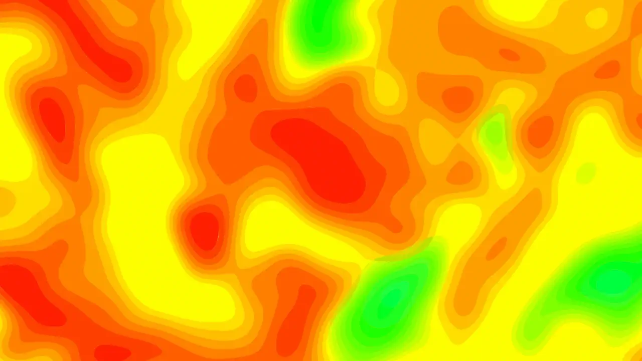
A heatmap is one of the most effective ways to visualize density. Instead of plotting individual points that overlap and obscure each other, you map values to colors across a grid. Suddenly, patterns jump out. Hot spots become obvious. Correlations between two dimensions reveal themselves. It's the visualization equivalent of squinting at a scatter plot until it makes sense, but doing it instantly.
I've built heatmaps for analytics dashboards, user behavior tools, and financial data explorers. The library you choose matters more than you might think. Some libraries treat heatmaps as an afterthought—a checkbox on a feature list. Others were built with heatmaps as a first-class citizen, and it shows in the API, performance, and customization options.
This guide covers the best React heatmap chart libraries in 2026, evaluated specifically for heatmap use cases. If you've read our React chart library comparison, you know the general landscape. But heatmaps have their own ecosystem, and the best options aren't always the ones that dominate generic charting.
What Makes a Heatmap Different from a Regular Chart
Before we dive in, let's clarify why heatmaps require specialized tools.
A standard chart—line, bar, pie—plots one or two dimensions: time on the x-axis, value on the y-axis. A heatmap plots a matrix. Rows and columns represent two categorical or temporal dimensions, and each cell's value is encoded as color. The data structure is fundamentally different: it's a 2D array, not a list of points.
Heatmaps also have unique rendering challenges. A 100×100 heatmap has 10,000 cells. That's 10,000 DOM elements if you use SVG, which will crush the browser. Canvas rendering is almost always necessary for anything beyond a few hundred cells. And interactivity—hover tooltips, click handlers, selection—needs to work across the grid without adding per-cell DOM overhead.
The libraries that handle heatmaps well are the ones that recognize these constraints. They use canvas by default, provide efficient data mapping, and expose the right customization hooks. The ones that treat heatmaps as an afterthought usually produce slow, inflexible results.
If you're dealing with truly massive grids—think thousands of rows and columns—the performance strategies from our React charting library performance benchmarks and large dataset guide apply here too.
The Contenders: React Heatmap Libraries in 2026
The heatmap library landscape splits into three categories: general chart libraries with strong heatmap support, dedicated heatmap components, and high-performance commercial solutions. Here are the ones worth knowing.
Apache ECharts (with echarts-for-react): The Feature-Rich Workhorse
Apache ECharts is one of the most popular charting libraries in the world, and its heatmap support is extensive. The echarts-for-react wrapper makes it straightforward to use in React.
What sets it apart:
- Dedicated heatmap series type. You configure a
heatmapseries with x and y category axes, and ECharts handles the rest. - Cartesian and calendar heatmaps. ECharts supports both matrix-style heatmaps and calendar heatmaps (like GitHub's contribution graph).
- Visual mapping. The
visualMapcomponent lets you map values to colors with piecewise or continuous scales. You can customize the color range, opacity, and even the shape of the visual map legend. - Large dataset support. ECharts uses canvas rendering and can handle tens of thousands of data points with
largemode enabled. - Rich interactivity. Tooltips, click events, brush selection, and data zoom all work out of the box.
- Active maintenance. ECharts is actively developed with regular releases and a large community.
import ReactECharts from "echarts-for-react";

function HeatmapChart({ data }) {
  const option = {
    tooltip: { position: "top" },
    grid: { height: "70%", top: "10%" },
    xAxis: {
      type: "category",
      data: ["Mon", "Tue", "Wed", "Thu", "Fri", "Sat", "Sun"],
    },
    yAxis: {
      type: "category",
      data: ["Morning", "Afternoon", "Evening", "Night"],
    },
    visualMap: {
      min: 0,
      max: 100,
      calculable: true,
      orient: "horizontal",
      left: "center",
      bottom: "0%",
      inRange: {
        color: ["#f0f9ff", "#0ea5e9", "#0c4a6e"],
      },
    },
    series: [
      {
        name: "Activity",
        type: "heatmap",
        data: data, // [[xIndex, yIndex, value], ...]
        label: { show: false },
        emphasis: {
          itemStyle: { shadowBlur: 10, shadowColor: "rgba(0, 0, 0, 0.5)" },
        },
      },
    ],
  };

  return <ReactECharts option={option} style={{ height: 400 }} />;
}
What to watch out for: The bundle size. ECharts is large (~1 MB uncompressed), though tree-shaking can reduce it if you import only the modules you need. The echarts-for-react wrapper is mature but adds a layer of indirection. For simple heatmaps, it may be overkill.
When to choose it: You need a feature-rich heatmap with calendar support, visual mapping, and interactivity, and bundle size isn't a primary concern. ECharts is my top pick for general-purpose heatmap needs.
Nivo: The Beautiful, Declarative Option
Nivo is a React charting library built on D3. It's known for beautiful defaults and a clean, declarative API. Its heatmap component is one of the most polished in the ecosystem.
What sets it apart:
- Declarative React API. Nivo components feel like React components, not wrappers around imperative libraries.
- Beautiful defaults. The color schemes, typography, and spacing look professional without any configuration.
- Server-side rendering support. Nivo renders to SVG, which means it works with Next.js server components.
- Interactive tooltips. Hover tooltips work out of the box, with customization options.
- Legend and axis customization. You can control labels, colors, and layout.
import { ResponsiveHeatMap } from "@nivo/heatmap";

function Heatmap({ data }) {
  return (
    <div style={{ height: 400 }}>
      <ResponsiveHeatMap
        data={data}
        margin={{ top: 60, right: 60, bottom: 60, left: 60 }}
        valueFormat=">-.2s"
        axisTop={null}
        axisRight={null}
        axisBottom={{
          tickSize: 5,
          tickPadding: 5,
          tickRotation: -45,
          legend: "Day",
          legendPosition: "middle",
          legendOffset: 46,
        }}
        axisLeft={{
          tickSize: 5,
          tickPadding: 5,
          tickRotation: 0,
          legend: "Time",
          legendPosition: "middle",
          legendOffset: -50,
        }}
        colors={{
          type: "sequential",
          scheme: "blues",
        }}
        emptyColor="#f5f5f5"
        borderWidth={1}
        borderColor={{ from: "color", modifiers: [["darker", 0.6]] }}
        enableLabels={false}
        animate={true}
        motionConfig="gentle"
      />
    </div>
  );
}
What to watch out for: Nivo's heatmap is SVG-based, which limits performance with large datasets. A 50×50 grid (2,500 cells) is fine; a 200×200 grid (40,000 cells) will struggle. If you need large grids, look at canvas-based options like ECharts or LightningChart. Also, Nivo's bundle size is moderate (~45 KB for the heatmap package), and the learning curve for deep customization is steeper than the declarative API suggests.
When to choose it: You want a beautiful, declarative heatmap with SVG rendering and server-side support, and your dataset is moderate in size. Nivo is excellent for dashboards and analytics interfaces where aesthetics matter.
react-heatmap-grid: The Lightweight, Customizable Grid
react-heatmap-grid is a simple, focused library that does one thing well: render a heatmap in a grid layout using <div> elements. It's lightweight, easy to customize, and doesn't try to be a full charting library.
What sets it apart:
- Lightweight and dependency-free. No D3, no canvas, just React and CSS.
- Simple API. You pass
xLabels,yLabels, and a 2Ddataarray. - Customizable cell rendering. You can override the cell content, background color, and click handlers.
- Responsive grid layout. The grid adapts to container width.
- Good for small to medium grids. Ideal for calendars, activity grids, and simple matrices.
import { HeatMap } from "react-heatmap-grid";

function ActivityHeatmap({ data }) {
  const xLabels = ["Mon", "Tue", "Wed", "Thu", "Fri", "Sat", "Sun"];
  const yLabels = ["Week 1", "Week 2", "Week 3", "Week 4"];

  return (
    <HeatMap
      xLabels={xLabels}
      yLabels={yLabels}
      data={data} // 2D array [y][x]
      squares={true}
      cellStyle={(background, value, min, max, x, y) => ({
        background: `rgba(66, 86, 244, ${1 - (max - value) / (max - min)})`,
        fontSize: "11px",
        color: "#fff",
      })}
      cellRender={(value) => value && <div>{value}</div>}
    />
  );
}
What to watch out for: The library renders a <div> for every cell, which means performance degrades with large grids. A 100×100 grid (10,000 divs) will be sluggish. The original repository hasn't been actively maintained in recent years, though community forks exist. For large datasets or advanced features like tooltips and legends, you'll need to build them yourself.
When to choose it: You need a simple, lightweight heatmap grid for a small dataset and want full control over the rendering. It's perfect for calendar heatmaps, activity grids, and internal tools where bundle size matters.
react-calendar-heatmap: The GitHub-Style Calendar Heatmap
If you want a heatmap that looks like GitHub's contribution graph—a year-long calendar with colored squares—react-calendar-heatmap is the go-to library. It's been around for years and is widely used.
What sets it apart:
- Calendar-specific layout. It renders a calendar grid with weeks as columns and days as rows.
- SVG-based. Each day is an SVG rectangle, which makes styling and tooltips straightforward.
- Customizable. You can control colors, tooltip content, and cell rendering.
- Lightweight. No heavy dependencies.
import CalendarHeatmap from "react-calendar-heatmap";
import "react-calendar-heatmap/dist/styles.css";

function ContributionGraph({ values }) {
  return (
    <CalendarHeatmap
      startDate={new Date("2026-01-01")}
      endDate={new Date("2026-12-31")}
      values={values} // [{ date: '2026-01-01', count: 5 }, ...]
      classForValue={(value) => {
        if (!value) return "color-empty";
        return `color-scale-${Math.min(value.count, 4)}`;
      }}
      tooltipDataAttrs={(value) => ({
        "data-tip": `${value.date} has count: ${value.count}`,
      })}
    />
  );
}
What to watch out for: It's SVG-based, so a full year of data (365 cells) is fine, but you wouldn't use it for a large matrix. The library is older and less actively maintained. For a more modern alternative, consider @uiw/react-heat-map (a fork with TypeScript support and a cleaner API) or react-activity-heatmap (a more recent, TypeScript-first library with React 19 support).
When to choose it: You need a GitHub-style contribution graph or a calendar-based heatmap for date-specific data. It's the most recognizable pattern for activity visualization.
Syncfusion React HeatMap Chart: The Enterprise Suite Option
Syncfusion's React HeatMap Chart is part of their larger UI component suite. It's a commercial product, though Syncfusion offers a free community license for small companies and individual developers.
What sets it apart:
- Canvas and SVG rendering modes. Syncfusion uses canvas rendering for large datasets and SVG for smaller ones, optimizing performance automatically.
- Matrix bubble chart support. In addition to standard heatmaps, Syncfusion supports a "matrix bubble" chart where cell values are represented as bubbles of varying sizes.
- Built-in legend and tooltip. Standard features are included out of the box.
- Theming. Fluent, Tailwind CSS, Bootstrap, Material, and Fabric themes built-in.
- Panning and zooming. For large heatmaps, users can pan and zoom to explore regions.
What to watch out for: The React wrapper is less performant than native React components. The licensing cost can be high for larger teams, though the community license is generous. If you're not already using Syncfusion components, the integration overhead may not be worth it.
When to choose it: You're already using Syncfusion components in your React application, or you need a feature-rich heatmap with matrix bubble support and enterprise theming.
Highcharts Heatmap: The Veteran with Module Loading
Highcharts is one of the most mature charting libraries, and its heatmap module extends the core library with heatmap support.
What sets it apart:
- Mature and battle-tested. Years of production usage, extensive documentation.
- Color axis and legend. Powerful visual mapping with
colorAxisfor gradient or piecewise color scales. - Data labels. Optional labels inside cells showing the value.
- Interactivity. Tooltips, click events, and selection work out of the box.
- React wrapper. The
highcharts-react-officialpackage is well-maintained.
import Highcharts from "highcharts";
import HighchartsReact from "highcharts-react-official";
import Heatmap from "highcharts/modules/heatmap";
Heatmap(Highcharts);

function HeatmapChart({ data }) {
  const options = {
    chart: { type: "heatmap" },
    title: { text: "Sales per employee" },
    xAxis: { categories: ["Mon", "Tue", "Wed", "Thu", "Fri"] },
    yAxis: { categories: ["Alice", "Bob", "Carol", "Dave"], title: null },
    colorAxis: {
      min: 0,
      max: 100,
      stops: [
        [0, "#f0f9ff"],
        [0.5, "#0ea5e9"],
        [1, "#0c4a6e"],
      ],
    },
    series: [
      {
        name: "Sales",
        data: data, // [[x, y, value], ...]
        dataLabels: { enabled: true, color: "#000" },
      },
    ],
  };

  return <HighchartsReact highcharts={Highcharts} options={options} />;
}
What to watch out for: The licensing. Highcharts is free for personal and non-commercial use, but commercial applications require a paid license. The bundle size is substantial—Highcharts core plus the heatmap module is several times larger than lightweight alternatives. For simple heatmaps, it may be overkill.
When to choose it: You're already using Highcharts in your application, or you need a mature, feature-rich heatmap with powerful color mapping and data labels. The commercial license is justifiable for many teams.
LightningChart: The High-Performance Commercial Option
LightningChart is a commercial charting library known for extreme performance, especially for real-time and high-density data. Its heatmap series is designed for massive datasets.
What sets it apart:
- WebGL and GPU acceleration. LightningChart uses WebGL to render heatmaps with tens of thousands of columns and rows. It's over 1000 times more efficient than average JS charting libraries for heatmaps, according to their benchmarks.
- Real-time capabilities. Static and scrolling heatmaps for real-time spectrograms, audio analysis, and medical diagnostics.
- Grid series and mesh. Support for both regular grid heatmaps and irregular mesh data.
- Rich customization. Color palettes, intensity, and shading options.
- React integration. Official React wrappers.
What to watch out for: The price. LightningChart is a commercial product with licensing costs that can be significant. It's not for small projects or budgets. The API is also more complex than simpler libraries, reflecting the power it provides.
When to choose it: You need to render truly massive heatmaps—thousands of rows and columns—with real-time updates. LightningChart is the performance king, but it comes at a cost.
Comparison Table: React Heatmap Libraries
| Library | Rendering | Grid Size | Bundle Size | License | Best For |
|---|---|---|---|---|---|
| Apache ECharts | Canvas | 10k+ cells | ~1 MB | Apache 2.0 | Feature-rich heatmaps with calendar support |
| Nivo | SVG | Up to ~2,500 cells | ~45 KB | MIT | Beautiful declarative heatmaps |
| react-heatmap-grid | DOM | Up to ~1,000 cells | Tiny | MIT | Simple grids, small datasets |
| react-calendar-heatmap | SVG | 365 cells | Small | MIT | GitHub-style contribution graphs |
| Syncfusion | Canvas/SVG | Large | ~200 KB | Commercial | Enterprise suites |
| Highcharts | SVG | Moderate | ~150 KB | Commercial | Mature heatmaps with color axis |
| LightningChart | WebGL | Massive (100k+) | ~500 KB | Commercial | Real-time, high-density heatmaps |
Decision Framework: Which React Heatmap Library Should You Choose?
Here's the decision tree I use when recommending heatmap libraries:
Are you rendering a calendar or contribution graph (one cell per day)? → react-calendar-heatmap (or
@uiw/react-heat-mapfor a modern TypeScript fork). It's the standard for date-based heatmaps.Do you need a simple grid heatmap for a small dataset and want minimal bundle size? → react-heatmap-grid. It's lightweight and fully customizable.
Do you want beautiful, declarative heatmaps with server-side rendering? → Nivo. The SVG rendering is excellent for moderate-sized datasets, and the defaults look great.
Do you need a feature-rich heatmap with calendar support, visual mapping, and large dataset handling? → Apache ECharts. It's the most versatile option, and the
echarts-for-reactwrapper is mature.Are you already using Highcharts or Syncfusion? → Stick with your existing suite. The integration savings outweigh the licensing cost for most teams.
Do you need to render massive heatmaps (100k+ cells) with real-time updates? → LightningChart. It's the only WebGL-accelerated option in this list, and it handles data volumes that would crush the others.
Do you need enterprise support and theming? → Syncfusion or Highcharts. Both offer professional support and extensive feature sets.
For most React teams starting a new heatmap, I recommend Apache ECharts for general-purpose needs, Nivo for beautiful dashboards, and react-heatmap-grid for simple grids. If you outgrow those, the commercial options are there.
Performance Considerations for Heatmaps
Heatmap performance is dominated by the same factors as other charts: rendering model and data volume. Here are the key considerations:
Canvas is almost always necessary for large grids. SVG heatmaps create a DOM node per cell. A 100×100 grid means 10,000 nodes, which will slow down rendering and interaction. ECharts, Syncfusion, and LightningChart use canvas (or WebGL) for this reason.
Enable large mode in ECharts. ECharts has a large: true option for heatmap series that enables optimizations for high data volumes. It's not enabled by default.
Downsample or aggregate if possible. If you're visualizing a 1000×1000 matrix, users can't perceive individual cells at that density. Aggregate the data into larger buckets (e.g., 100×100) for an overview, and allow drill-down for detail.
Limit interactivity to the visible region. If you implement custom tooltips or hover effects, make sure you're not doing expensive calculations on every mouse move. Throttle or debounce these handlers, as we covered in our JavaScript debounce vs throttle guide.
Memoize the chart component. Wrap your heatmap in React.memo and ensure props are stable. This prevents unnecessary re-renders when the parent component updates. If you've read our React chart library performance benchmarks, you know this is critical for dashboards with multiple charts.
A Real Story: Heatmaps for User Behavior Analytics
A few years ago, I worked on a user behavior analytics tool that visualized click and scroll data as heatmaps. The original implementation used a custom SVG grid. It worked fine for a 20×20 grid (400 cells), but as the product grew, customers wanted to visualize weeks of data with granular time buckets. The grid expanded to 100×200 (20,000 cells). The SVG approach collapsed—rendering took 5 seconds, and hovering was unusable.
We migrated to Apache ECharts. The canvas rendering handled the 20,000-cell grid in under 200ms. The visual map component let us customize the color scale to match our brand. The tooltip worked smoothly across the grid. We also added brush selection for filtering time ranges, which ECharts supported out of the box.
The lesson: for heatmaps, the rendering model is everything. SVG is fine for small grids; canvas is mandatory for anything beyond a few thousand cells. ECharts gave us the performance and features we needed without building a custom canvas renderer from scratch.
Community Resources and Further Learning
The heatmap visualization community is active, though more niche than the general charting world. Here are the resources I've found most valuable:
- GitHub – awesome-heatmap (https://github.com/awesome-heatmap/awesome-heatmap) — A curated list of heatmap libraries and tools, including many React options.
- r/reactjs on Reddit (https://www.reddit.com/r/reactjs/) — Discussions about heatmap libraries and visualization challenges appear regularly.
- dev.to (https://dev.to/t/react) — Tutorials and case studies on React heatmap visualization.
- Apache ECharts documentation (https://echarts.apache.org/) — Excellent docs with heatmap examples and API reference.
- Nivo documentation (https://nivo.rocks/heatmap/) — Interactive examples for the heatmap component.
Wrapping Up
The React heatmap library ecosystem has matured significantly. Apache ECharts provides a feature-rich, canvas-based solution that handles large datasets. Nivo offers beautiful, declarative SVG heatmaps for moderate-sized grids. react-heatmap-grid and react-calendar-heatmap serve specific niches with lightweight, focused components. And commercial options like Syncfusion, Highcharts, and LightningChart provide enterprise-grade performance and support.
The right choice depends on your data volume, rendering model preference, and budget. For most teams, I recommend starting with Apache ECharts for general-purpose heatmaps and Nivo for beautiful dashboard visualizations. If you're building a calendar or contribution graph, react-calendar-heatmap (or its TypeScript forks) is the standard.
If you're building a broader dashboard, don't miss our guides on the best React chart library for dashboards and React charting library performance benchmarks. The right visualization stack is more than just a heatmap—it's a cohesive set of tools that work well together.
Now go build something that makes data density beautiful.
Need help building a heatmap or density visualization in your React app? Red Surge Technology specializes in data-rich, high-performance interfaces for analytics, fintech, and enterprise dashboards. Get in touch to discuss your project.