 Call us: (732) 520-3386
 Email us: info@redsurgetechnology.com




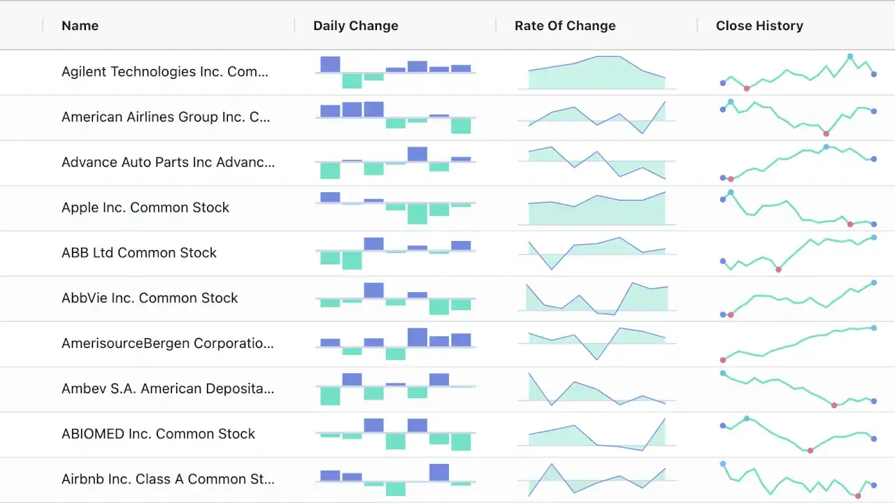
A sparkline is one of those visualizations that seems trivial until you actually need one. It's a tiny line chart—no axes, no labels, no gridlines—that sits inline with text or inside a KPI card. It shows a trend in the space of a few characters. A number tells you a value; a sparkline tells you the shape of that value over time. Did revenue go up steadily or spike and crash? Is server latency trending worse or holding steady?
I've built dashboards where sparklines were an afterthought, bolted on with a hacked-together SVG. I've also built dashboards where the right sparkline library made them look and feel professional with almost no effort. The difference usually comes down to picking a library that's purpose-built for the job.
Sparklines have unique requirements. They're too small for axes, so you need to render the full data range within a tiny viewport. They often appear dozens or hundreds of times on a single dashboard, so performance matters even though each individual chart is simple. And they need to be lightweight—bundling a full charting library like Recharts or Highcharts just for a 40-pixel line is wasteful.
This guide covers the best React sparkline chart libraries in 2026, evaluated specifically for sparkline use cases. If you've read our React chart library comparison, you know the general landscape. But sparklines are a niche within a niche, and the best options aren't always the ones that dominate generic charting.
What Makes a Sparkline Different from a Regular Chart
Before we dive in, let's clarify what sets sparklines apart from standard charts.
Size. A sparkline is typically 20–40 pixels tall and 80–200 pixels wide. It's meant to be read at a glance, not studied. The visual language is compressed.
Data density. Because the viewport is small, you can't show every data point as a distinct shape. The line itself is the visualization. A sparkline with 50 points and a sparkline with 500 points look similar at a glance—the shape is what matters.
No chrome. No axes, no labels, no gridlines, no legend. Just the line. This is what makes sparklines so compact and versatile.
Inline placement. Sparklines often sit next to text—a KPI card showing "Revenue: $1.2M" with a tiny trend line beside it. They need to be stylable and sized to fit into arbitrary containers.
Volume. A dashboard might show 50 sparklines at once. Each one is simple, but together they need to perform. This is where rendering efficiency matters.
If you're dealing with large datasets and general charting, our React charting library for large datasets guide covers the broader performance strategies. Sparklines have their own specific constraints.
The Contenders: React Sparkline Libraries in 2026
The sparkline library landscape splits into three categories: lightweight purpose-built components, general chart libraries with sparkline support, and enterprise suites. Here are the ones worth knowing.
react-sparklines: The Classic, Battle-Tested Option
react-sparklines is the original React sparkline library. It's been around for years, is MIT-licensed, and has a simple, declarative API. It renders sparklines as SVG and supports line, bar, and "spot" (dots) visualizations.
What sets it apart:
- Simple API. Pass an array of numbers and get a sparkline.
- Multiple chart types. Line, bar, and spot modes.
- Customizable. You can control colors, stroke width, fill, and even provide custom SVG paths for gradients.
- Lightweight. No heavy dependencies.
- Widely used. A large community and many examples.
import {
  Sparklines,
  SparklinesLine,
  SparklinesBars,
  SparklinesSpots,
  SparklinesReferenceLine,
} from "react-sparklines";

function TrendIndicator({ data }) {
  return (
    <Sparklines data={data} width={120} height={40} margin={5}>
      <SparklinesLine color="#3b82f6" style={{ fill: "none" }} />
      <SparklinesSpots />
      <SparklinesReferenceLine type="mean" />
    </Sparklines>
  );
}
The SparklinesReferenceLine is a nice touch—it draws a line at the mean, median, or a custom value, giving context to the trend.
What to watch out for: The original repository hasn't been actively maintained for several years. Community forks exist (like @jrwats/react-sparklines), but they're also aging. The SVG rendering is fine for a few sparklines, but if you're rendering hundreds, the DOM node count adds up. Also, the API is less flexible than newer libraries for things like gradient fills or custom tooltips.
When to choose it: You need a simple, reliable sparkline and want a library that's been used in production for years. It's still a solid choice for dashboards with a moderate number of sparklines.
react-sparkline-chart: The Modern, Zero-Dependency Option
react-sparkline-chart is a newer library that's gained traction for its beautiful defaults and zero-dependency approach. It renders smooth curves with gradient fills and works with React 17, 18, and 19.
What sets it apart:
- Beautiful defaults. Smooth curves, gradient fills, and a polished look out of the box.
- Zero dependencies beyond React. Nothing else to install or manage.
- React 17, 18, and 19 support. Stays current with React releases.
- Customizable. You can control colors, gradients, stroke width, and fill opacity.
- Small bundle size. Because it has no dependencies, the footprint is tiny.
import SparklineChart from "react-sparkline-chart";

function KPITrend({ data }) {
  return (
    <SparklineChart
      data={data}
      width={120}
      height={40}
      color="#10b981"
      gradient={true}
      curve="smooth"
    />
  );
}
The gradient option fills the area under the line with a subtle gradient, which looks great in KPI cards. The curve option can be smooth or linear, giving you control over the visual style.
What to watch out for: The library is newer, so the ecosystem and community are smaller. The API is less extensive than react-sparklines—if you need bars, spots, or reference lines, you'll need a different tool. But for simple line sparklines with a modern look, it's excellent.
When to choose it: You want beautiful, modern sparklines with minimal setup and zero dependencies. It's my top pick for new projects that need inline trend lines.
react-trend: The Minimalist "Does One Thing" Option
react-trend is a minimalist library that generates smooth, elegant sparklines. It's designed to do one thing well: render a trending graph. It's been around for years and is MIT-licensed.
What sets it apart:
- Extremely simple API. Pass an array of numbers, get a sparkline.
- Smooth curves. The default rendering uses bezier curves for a polished look.
- Gradient support. You can apply gradients to the stroke.
- Lightweight. Minimal dependencies.
import Trend from "react-trend";

function MiniTrend({ data }) {
  return (
    <Trend
      data={data}
      width={100}
      height={30}
      stroke="#8b5cf6"
      strokeWidth={2}
      gradient={["#8b5cf6", "#ec4899"]}
      autoDraw={true}
    />
  );
}
The autoDraw option animates the line drawing on mount, which is a nice touch for dashboards.
What to watch out for: The library hasn't been updated in years. It's SVG-based, so performance with many sparklines is limited. It doesn't support bars or spots—just lines. And it lacks some of the customization options of newer libraries. But for a simple, elegant sparkline, it still works well.
When to choose it: You need a no-frills sparkline with a smooth curve and want a library that's been around and stable.
@data-ui/sparkline: The Composable, D3-Powered Option
@data-ui/sparkline is a React + D3 library for sparklines, part of the broader data-ui toolkit. It's composable, meaning you can mix and match different series types and reference lines.
What sets it apart:
- Composable API. Use
<Sparkline>as a container with different<*Series>children (line, area, bar, etc.) and reference lines or bands. - D3-powered. Built on D3 scales and shapes, so you get precise control over rendering.
- Reference bands. You can add shaded regions to indicate ranges (e.g., "normal" vs "warning" zones).
- Tooltip support. Optional tooltips on hover.
import {
  Sparkline,
  LineSeries,
  PointSeries,
  ReferenceLine,
} from "@data-ui/sparkline";

function ComposableSparkline({ data }) {
  return (
    <Sparkline
      data={data}
      width={120}
      height={40}
      margin={{ top: 5, right: 5, bottom: 5, left: 5 }}
    >
      <LineSeries stroke="#3b82f6" strokeWidth={2} />
      <PointSeries points={["last"]} fill="#3b82f6" />
      <ReferenceLine y={0} stroke="#ccc" strokeDasharray="3 3" />
    </Sparkline>
  );
}
The ability to add reference lines and point markers makes this library more flexible than the simpler options.
What to watch out for: The library is older and less actively maintained. It's part of the data-ui ecosystem, which has been largely superseded by other tools. The bundle size is larger than the zero-dependency options because of the D3 dependencies.
When to choose it: You need composable sparklines with reference bands or point markers, and you're comfortable with D3-style APIs.
ChartKit: The Lightweight Dashboard Library with Sparkline Support
ChartKit is a relatively new lightweight React charting library built on uPlot. It's canvas-based, themeable via CSS variables, and includes a Sparkline component among its 14 components.
What sets it apart:
- Canvas rendering. Fast, even with many sparklines.
- Built for dashboards. Includes KpiCard, MetricCard, and Sparkline components that work together.
- Themeable. CSS variables make it easy to match your design system.
- Lightweight. Built on uPlot, which is known for its small size and performance.
import { Sparkline } from "@derpdaderp/chartkit";

function KPICard({ value, data }) {
  return (
    <div className="kpi-card">
      <span className="value">{value}</span>
      <Sparkline data={data} width={100} height={30} color="#10b981" />
    </div>
  );
}
What to watch out for: The library is newer, so the ecosystem is smaller. The canvas rendering means less CSS styling flexibility than SVG options. But for dashboards with many sparklines, the performance is excellent.
When to choose it: You're building a dashboard with many sparklines and want a lightweight, canvas-based solution with a cohesive set of components.
Syncfusion React Sparkline: The Enterprise Suite Option
Syncfusion's React Sparkline is part of their larger UI component suite. It's a commercial product, though Syncfusion offers a free community license for small companies and individual developers.
What sets it apart:
- Multiple sparkline types. Line, column, area, win-loss, and pie.
- Axis customization. You can set value types, min/max, and even show axis lines.
- Markers and data labels. Optional markers on data points and labels for values.
- Range band. Highlight a specific range with a shaded band.
- Theming. Fluent, Tailwind CSS, Bootstrap, Material, and Fabric themes built-in.
What to watch out for: The React wrapper is less performant than native React components. The licensing cost can be high for larger teams, though the community license is generous. If you're not already using Syncfusion components, the integration overhead may not be worth it.
When to choose it: You're already using Syncfusion components in your React application, or you need a feature-rich sparkline with range bands and multiple series types.
KendoReact Sparkline: The Telerik Option
KendoReact Sparkline is part of the KendoReact UI library from Telerik. Like Syncfusion, it's commercial with a free trial and various licensing tiers.
What sets it apart:
- Tiny, axis-less charts. Designed specifically for inline trend visualization.
- Multiple series types. Line, bar, column, area, and pie.
- Customizable. Colors, markers, and tooltips.
- Integration with the KendoReact ecosystem. If you're using KendoReact for other components, the sparkline fits naturally.
What to watch out for: The licensing cost and the bundle size. For a simple sparkline, it's overkill unless you're already in the KendoReact ecosystem.
When to choose it: You're already using KendoReact components and want a sparkline that integrates seamlessly.
Comparison Table: React Sparkline Libraries
| Library | Rendering | Dependencies | Bundle Size | License | Best For |
|---|---|---|---|---|---|
| react-sparklines | SVG | Moderate | ~15 KB | MIT | Classic, battle-tested option |
| react-sparkline-chart | SVG | None (React only) | ~5 KB | MIT | Modern, beautiful defaults |
| react-trend | SVG | Minimal | ~10 KB | MIT | Minimalist smooth lines |
| @data-ui/sparkline | SVG | D3 | ~30 KB | MIT | Composable, reference bands |
| ChartKit | Canvas | uPlot | ~20 KB | MIT | Dashboards with many sparklines |
| Syncfusion | SVG | Suite | ~150 KB | Commercial | Enterprise suites |
| KendoReact | SVG | Suite | ~200 KB | Commercial | KendoReact ecosystem |
Decision Framework: Which React Sparkline Library Should You Choose?
Here's the decision tree I use when recommending sparkline libraries:
Do you want beautiful, modern sparklines with zero dependencies? → react-sparkline-chart. It's my top pick for new projects. The gradient fills and smooth curves look great in KPI cards.
Do you need a battle-tested, feature-rich sparkline with bars, spots, and reference lines? → react-sparklines. It's the classic, and it still works well.
Do you need a minimalist, elegant sparkline with smooth curves and animation? → react-trend. It does one thing well.
Do you need composable sparklines with reference bands and D3-style control? → @data-ui/sparkline. It's more complex but more flexible.
Are you rendering dozens or hundreds of sparklines in a dashboard? → ChartKit (canvas-based) for performance, or react-sparkline-chart if you prefer SVG.
Are you already using Syncfusion or KendoReact? → Stick with your suite. The integration savings outweigh the licensing cost for most teams.
For most React teams starting fresh, I recommend react-sparkline-chart for its modern look and zero dependencies. If you need more features or a proven track record, react-sparklines is the safe choice.
Performance Considerations for Sparklines
Sparkline performance is dominated by the same factors as other charts: rendering model and volume. Here are the key considerations for dashboards with many sparklines:
SVG vs canvas. SVG sparklines create a DOM node per sparkline (and per data point if you're rendering spots). A dashboard with 100 sparklines is 100 SVG elements—manageable. But 100 sparklines with spots could be 1,000+ nodes. Canvas sparklines (like ChartKit) render to a single element per sparkline, reducing DOM overhead. If you're rendering hundreds of sparklines, canvas is the better choice.
Downsample if needed. Sparklines are small, so you don't need to render every data point. If your data has 1,000 points but the sparkline is 100 pixels wide, downsampling to 100–200 points preserves the shape and reduces rendering work. If you've read our guide on React charting libraries for large datasets, you know the techniques: min-max decimation and LTTB are both effective for sparklines.
Memoize sparkline components. If your dashboard re-renders frequently (e.g., from live data updates), wrap each sparkline in React.memo and ensure props are stable. This prevents unnecessary re-renders of dozens of tiny charts. Our guide on preventing unnecessary re-renders in React covers the patterns.
Debounce data updates. If your sparklines are updating in real time, throttle or debounce the data stream to avoid re-rendering every sparkline on every tick. Our JavaScript debounce vs throttle guide has the details.
Test on real devices. A dashboard with 100 SVG sparklines might look fine on a fast laptop but stutter on a mid-range Android tablet. Always test on representative hardware.
A Real Story: Sparklines in a Server Monitoring Dashboard
A few years ago, I worked on a server monitoring dashboard that displayed metrics for 200+ servers. Each server had a KPI card showing CPU usage, memory, disk I/O, and network traffic—each with a small sparkline showing the last hour of data. That's 800 sparklines on a single page.
The initial implementation used react-sparklines. It worked on small deployments, but with 200 servers (and therefore 800 sparklines), the dashboard became sluggish. Scrolling stuttered, and live updates caused visible lag.
We profiled the page and found the issue: each SVG sparkline was a separate DOM subtree, and 800 of them meant thousands of DOM nodes. The browser was spending more time on layout and paint than on rendering the actual data.
We migrated to a canvas-based approach, similar to what ChartKit provides. Each sparkline rendered to a small canvas element, reducing the DOM node count from thousands to 800 (one per sparkline). The performance improvement was immediate—scrolling became smooth, and live updates no longer caused stutter.
The lesson: for dashboards with many sparklines, rendering model matters more than anything else. SVG is fine for a handful of sparklines; canvas is necessary for hundreds.
Community Resources and Further Learning
The sparkline community is smaller than the general charting community, but there are still valuable resources:
- GitHub – react-sparklines (https://github.com/borisyankov/react-sparklines) — The original library, with examples and documentation.
- GitHub – react-sparkline-chart (https://github.com/... ) — The modern, zero-dependency alternative.
- r/reactjs on Reddit (https://www.reddit.com/r/reactjs/) — Discussions about sparklines and lightweight charting appear occasionally.
- dev.to (https://dev.to/t/react) — Tutorials and case studies on React sparklines.
- uPlot (https://github.com/leeoniya/uPlot) — The lightweight canvas charting library that powers ChartKit; useful for building custom sparkline renderers.
Wrapping Up
Sparklines are a small but powerful visualization. They add context to numbers without taking up much space. The React ecosystem has several excellent libraries, from the classic react-sparklines to the modern react-sparkline-chart and the performance-focused ChartKit.
The right choice depends on your volume, rendering preference, and feature needs. For most teams, react-sparkline-chart offers the best balance of modern aesthetics, zero dependencies, and simplicity. If you need more features, react-sparklines is the proven option. And if you're rendering hundreds of sparklines, look at canvas-based solutions like ChartKit.
If you're building a broader dashboard, don't miss our guides on the best React chart library for dashboards and React charting library performance benchmarks. The right visualization stack is more than just a sparkline—it's a cohesive set of tools that work well together.
Now go build something that makes trends visible at a glance.
Need help building a dashboard with sparklines or inline trend visualizations? Red Surge Technology specializes in data-rich, high-performance interfaces for dashboards, fintech, and analytics platforms. Get in touch to discuss your project.